The Challenge: I wanted to quantify "funny." The goal was to gather a group of people to watch a comedy film and capture their reactions in real-time. I needed to know: Do jokes land at the same time for everyone? What is the "punchline density" of a film? Which scenes are the undisputed crowd-pleasers?
After researching with Gemini, I realized that existing professional tools for continuous response measurement were either prohibitively expensive or not designed for simple, multi-user mobile interaction.
The Solution: Using a "Vibe Coding" approach—collaborating with Gemini for architecture and Claude for rapid code generation—I built a fully functional, cloud-synced analytics suite in just 3 hours.
The Architecture:
1. The Remote (Mobile UI)
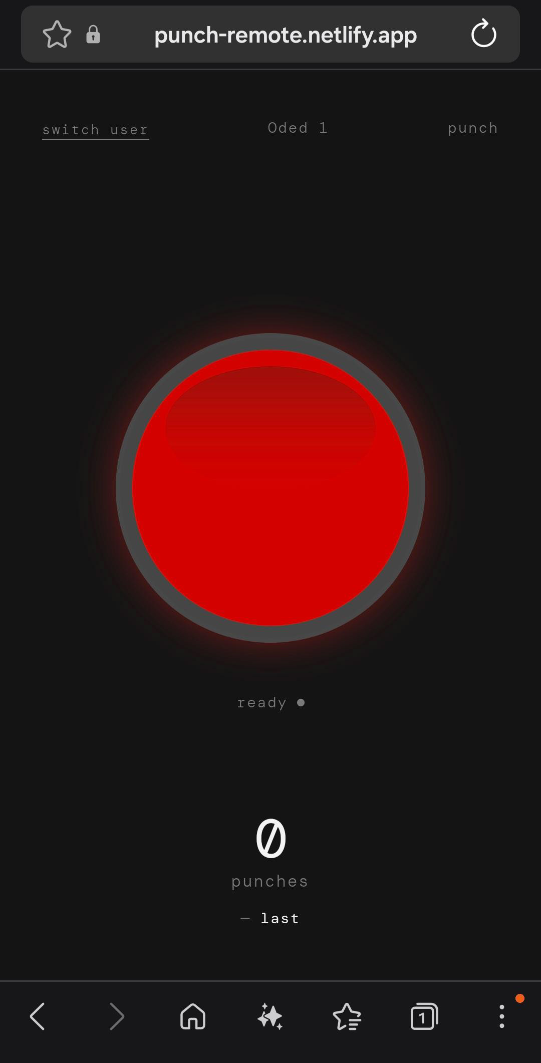
Designed for zero-friction. Users join via a session code, enter their name, and are presented with a single, massive red button. No distractions—just a tactile interface that records "Start" and "End" timestamps of every laugh, complete with haptic feedback.
Designed for zero-friction. Users join via a session code, enter their name, and are presented with a single, massive red button. No distractions—just a tactile interface that records "Start" and "End" timestamps of every laugh, complete with haptic feedback.
2. The Host (Control Center)
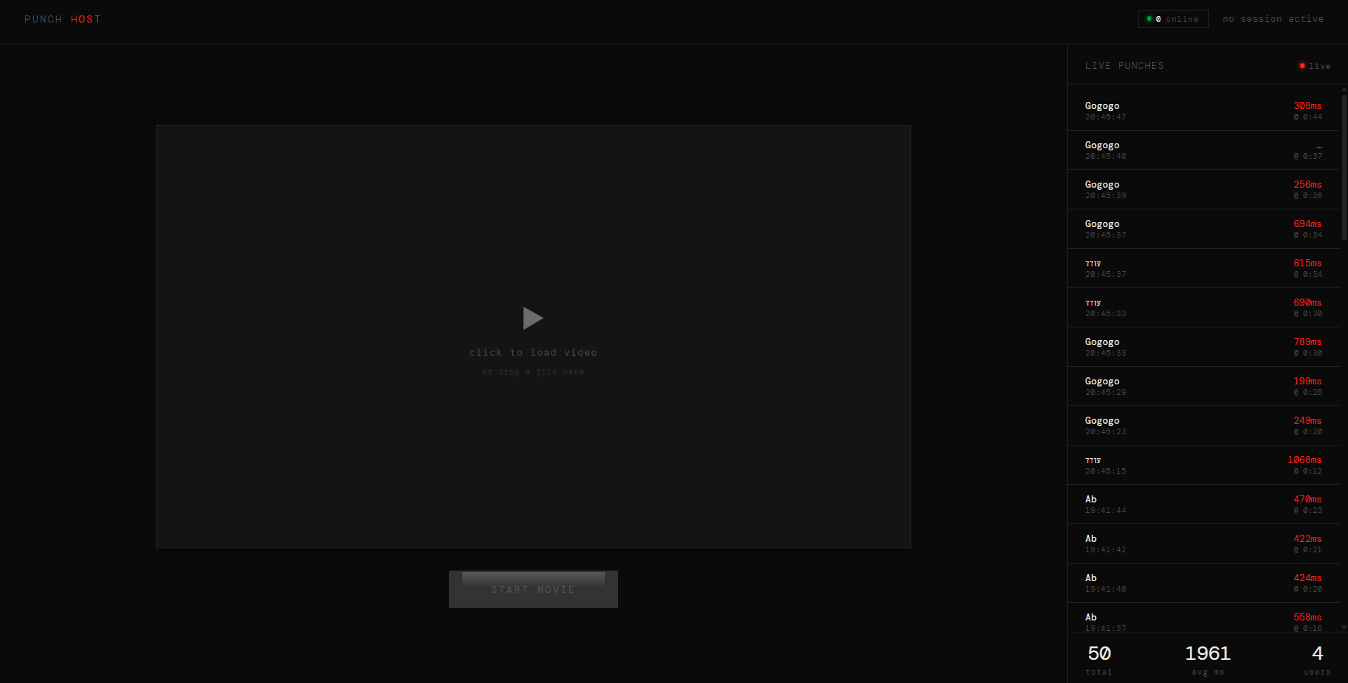
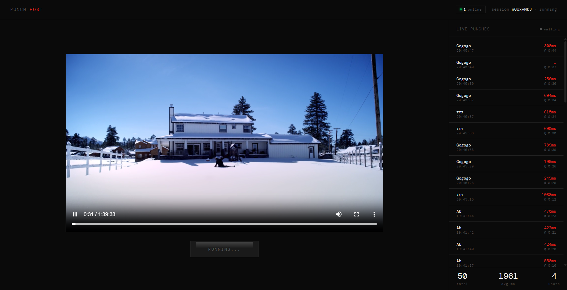
The "Director’s View." The tester loads a local video file, monitors the real-time "Heartbeat" of connected users, and triggers the session. As the movie plays, a live sidebar streams incoming "punches" from the audience, synced perfectly to the video’s current playtime.
The "Director’s View." The tester loads a local video file, monitors the real-time "Heartbeat" of connected users, and triggers the session. As the movie plays, a live sidebar streams incoming "punches" from the audience, synced perfectly to the video’s current playtime.
3. The Analyzer (Data Visualization)
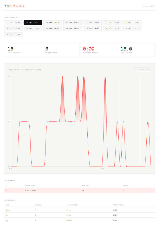
This is where the magic happens. Post-screening, the system generates a dynamic Heatmap Graph. It doesn't just count clicks; it calculates audience overlap. The "Mountain Graph" grows taller and more opaque when the consensus is high, visually identifying the funniest peaks of the film. Data can also be exported to CSV for deep-dive statistical analysis.
This is where the magic happens. Post-screening, the system generates a dynamic Heatmap Graph. It doesn't just count clicks; it calculates audience overlap. The "Mountain Graph" grows taller and more opaque when the consensus is high, visually identifying the funniest peaks of the film. Data can also be exported to CSV for deep-dive statistical analysis.
Beyond Comedy
While built for humor, the system is a versatile framework for any simultaneous audience marking:
- UX Research: Marking UI friction points during a demo.
- Media Analysis: Spotting product placements or specific character behaviors.
- Education: Students marking points of confusion during a lecture.
- UX Research: Marking UI friction points during a demo.
- Media Analysis: Spotting product placements or specific character behaviors.
- Education: Students marking points of confusion during a lecture.
The Tech Stack:
Gemini (Logic & Architecture) + Claude 4.6 Sonnet (UI/UX Code)
Backend: Firebase
Hosting: Netlify
Gemini (Logic & Architecture) + Claude 4.6 Sonnet (UI/UX Code)
Backend: Firebase
Hosting: Netlify